Cluster

Brand identity design. Service design

The mission

Using post-growth future perspectives, conceptualise and brand a space which focuses on how internet usage and habits can adapt to help the environment and the user.

Team: Emily Kinson, Lucy Timbury, Doireann O'Shaughnessy, Ben Totten

Our solution

Cluster aims to create a fun, collaborative space to motivate people's bodies and minds through a plethora of knowledge and well-being. Cluster aspires to bring the wonders of the natural world, fitness, and the satisfaction of learning new things together. 

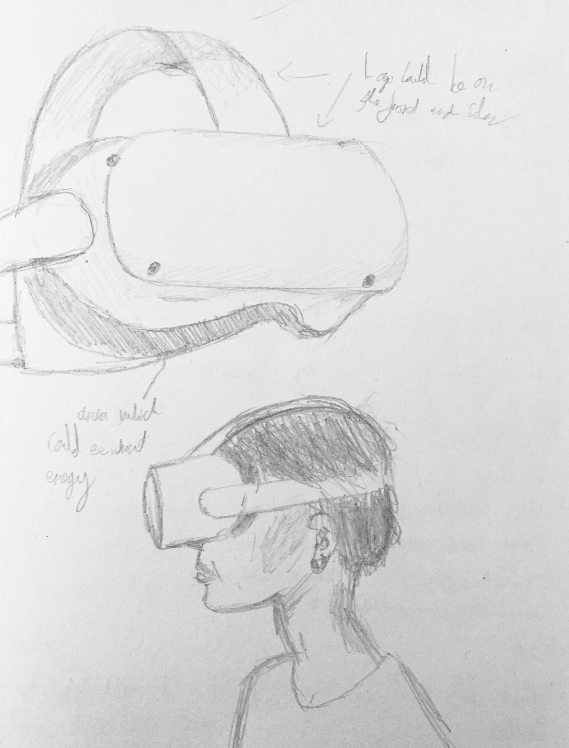
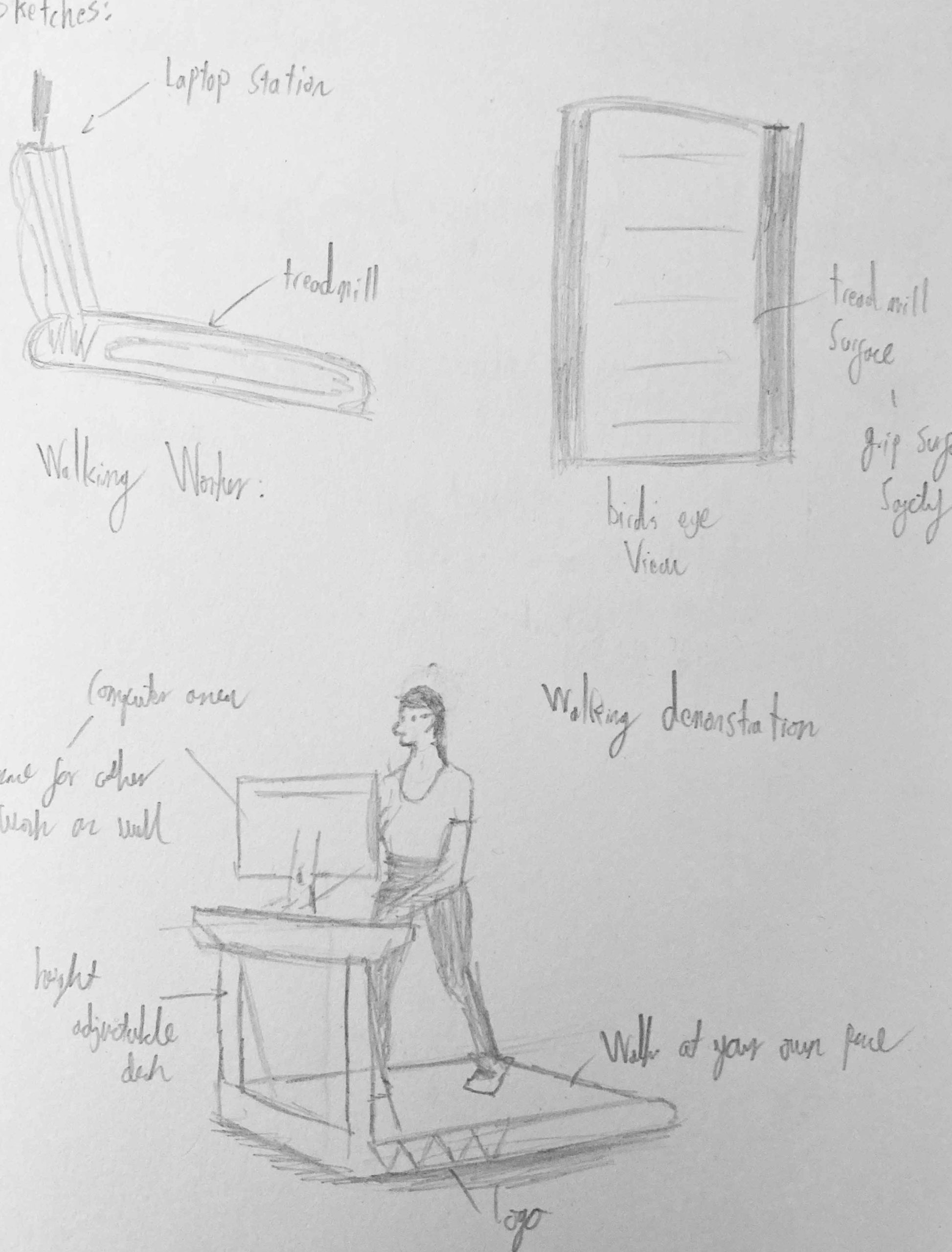
The space Cluster offers achieves this by providing a variety of accessible equipment for people of different ages and capabilities to exercise with. This equipment generates kinetic energy to power their internet usage. The more you exercise, the more internet usage is available to you. This allows users to keep healthy and positively influences their internet usage while being eco-friendly. Like a crystal cluster, the equipment and collaborative internet café are all found inside a collection of geodesic domes, working with the surrounding nature.

Cluster creates this space as we believe internet usage can change from being an unhealthy activity to something that benefits the user. We want to enhance users' mental, physical and social health through the routinely use of our services and space.

Our brand

dome-wall
flags
bag
bottles-wide
tshirts
cap
wifi-ad-web
location-ad-web
iphone-all
signup-mkup
homepage-mkup
Initial stages
As a group, we were given a critical object to research and then imagine an alternative, sustainable way to implement this object into modern day society. 
 
Our object was Global Internet
 
I first looked into main aspects of the internet like how it is powered and connected around the world. Therefore, if I could pinpoint the largest aspect of how the physical internet works, I could facilitate the greatest positive change.
group working on toolkit
Ideation
I conducted further research on things such as, kinetic energy, piezoelectric energy and body heat. This led to some initial concepts such as a VR headset utilising body heat, a pen which generates piezoelectric energy to charge devices and a walking machine to power a computer. 
The result
Feedback revealed that some of my ideas were predominately thinking of eco-friendly ways to power the internet and not considering how to decrease internet usage as well. Therefore, the team investigated the more communal ideas.
 
This idea of a communal social space which empowers connection with nature and healthy internet use led us to the idea Cluster.
isometric-dome
Visual identity
I started by researching what the inspiration for geodesic domes were, as that was a large aspect of our post-growth imaginary. I found that crystals were a source of inspiration for their construction. Therefore, I thought this could be a good idea to take forward as it relates to our imagination, while also having positive connotations. 
 
When constructing this, I considered how the wide target audience would need their own groups, as not everyone would be able to do the same amount of exercise in the domes. I decided to achieve this by varying the colour pallet of one logo. This would communicate additional needs or other factors in a positive way, whilst remaining within our visual identity.  
 
The crystal theme also led us nicely onto the naming of the brand. The collective name for a group of crystals was a cluster.
crystals1-black
Visual identity
Following discussions with tutors and amongst my team, we decided to expand the identity beyond crystals. Our name was solid, but our visual identity needed to reflect what we were offering and appeal to our main target audience of twenty- to thirty-year-olds as Cluster’s social and networking aspects were most relevant to this age group. 
 
I thought about what people think of when they think “cluster.”
 
I combined isometric cubes in a cluster format to see if a desirable shape would emerge from this. From this purposeful play with shapes, I found semiotics within them and produced a final visual identity. 
 
I experimented with colour after the shape was finished and settled on a combination of pastel colours reflecting nature and structure. 
logo-process1
blue1red1pale1orange1green1green2mc4mc2mc1mc3blue1red1pale1orange1green1green2mc4mc2mc1mc3blue1red1pale1orange1green1green2mc4mc2mc1mc3
Text
After experimentation, the ‘Fit’ typeface looks clustered together, I simply thought it reflected the name well, but it needed some modifications. I adjusted the overall tracking to make it more legible along with the letters inside line spacing. These spacing adjustments allowed the font to work in harmony with the logo.  
154236154236154236
text-gap
text-align
logo
logo-type

Summary

Back to top Arrow